Wednesday, February 29, 2012

Typesetting Style Guidelines

Your typesetting will look professional when you follow these style guidelines.
Use only one space between sentences (double spacing is only for those dinosaurs we call typewriters).

Use real quotation marks and apostrophes (Preferences>Use typographers quotes); use proper punctuation with parentheses.

Use special characters (glyphs), en and em dashes (to differentiate from hyphens) where appropriate.
  1. Hyphen -
  2. en (n) dash (option + -) –
  3. em (m) dash (shift + option + -) —


Spend the time to make nice fractions and use correct accent marks (glyphs).

Use bold or italic for emphasis, never underline. Use them sparingly.

AVOID THE USE OF ALL CAPS, even in headlines. It looks like you're screaming.

Kern (tighten or decrease tracking) headlines when necessary.

Never, ever use the spacebar to align text! Use Paragraph Alignment.

Regarding the indenting of paragraphs: use a one-em first line indent space on all indented paragraphs; don't indent first paragraphs. Use the Paragraph Panel and Paragraph Styles to define indents.

Leave no widows or orphans (see below).

Avoid more than two hyphenations in a row. Avoid too many hyphenations in any paragraph; check line breaks carefully.

Keep line spacing (leading) consistent.

Either indent the first line of paragraphs or add extra space between them -- but not both.

Never justify text on a short line.

Avoid combining more than three typefaces in a document. 

Let your text breathe: embrace white space; don't crowd text inside a box or up against a graphic element.

Use bullets when making a list, not hyphens.

Avoid abbreviations.

Reduce the size of punctuation marks in headlines; avoid hyphenation in headlines

Set the space before an italic word in italic, but not the space after.

Don't be a wimp.
-- Adapted from "The Mac is not a Typewriter," Robin Williams, 2003


Don't confuse readablility with legibility

Legibility is primarily the concern of the typeface designer, to ensure that each individual character or glyph is unambiguous and distinguishable from all other characters in the font. Legibility is also in part the concern of the typographer to select a typeface with appropriate clarity of design for the intended use at the intended size. An example of a well-known design, Brush Script, contains a number of illegible letters since many of the characters can be easily misread especially if seen out of textual context. 

Readability is primarily the concern of the typographer or information designer. It is the intended result of the complete process of presentation of textual material in order to communicate meaning as unambiguously as possible. A reader should be assisted in navigating around the information with ease, by optimal inter-letter, inter-word and particularly inter-line spacing, coupled with appropriate line length and position on the page, careful editorial “chunking” and choice of the text architecture of titles, folios, and reference links.

One of the clearest distinctions between the two concepts was presented by Walter Tracy in his Letters of Credit:
"These … ‘two aspects of a type’ … are … ‘fundamental to its effectiveness. Because the common meaning of 'legible' is 'readable' there are those – even some professionally involved in typography – who think that the term 'legibility' is all that is needed in any discussion on the effectiveness of types. But legibility and readability are separate, though connected aspects of type. Properly understood … the two terms can help to describe the character and function of type more precisely than legibility alone. … In typography we need to draw the definition … of legibility …to mean the quality of being decipherable and recognisable – so that we can say, for example, that the lowercase h in a particular old style italic is not legible in small sizes because its in-turned leg makes it look like the letter b; or a figure 3 in a classified advertisement is too similar to the 8. … In display sizes, legibility ceases to be a serious matter; a character that causes uncertainty at 8 point size is plain enough at 24 point."


Widows and Orphans


"Never leave widows and orphans bereft on the page."
— "The Mac is not a Typewriter," Robin Williams


In typesetting, widows and orphans are words or short lines at the beginning or end of a paragraph, which are left dangling at the top or bottom of a column, separated from the rest of the paragraph. There is some disagreement about the definitions of widow and orphan; what one source calls a widow the other calls an orphan. The Chicago Manual of Style uses these definitions:

Widow
  • A paragraph-ending line that falls at the beginning of the following page/column, thus separated from the remainder of the text. (See below, paragraph #1.)
Orphan
  • A paragraph-opening line that appears by itself at the bottom of a page/column. (See below, highlighted text.)
  • A word, part of a word, or very short line that appears by itself at the end of a paragraph. Orphans result in too much white space between paragraphs or at the bottom of a page.

A common mnemonic (memory "hook") is, "An orphan has no past; a widow has no future," or "An orphan is left behind, whereas a widow must go on alone." Think of it this way: orphans are younger than widows, thus orphaned lines happen first at the start of paragraphs (affecting and stranding the first line) and widowed lines happen last at the end of paragraphs (affecting and stranding the last line). Orphaned lines appear at the "birth" (start) of the page or column; widowed lines appear at the "death" (end) of paragraphs.

Type on a path


Type can also be set along a vector path – be it a curvy path or a polygon, or open or closed path. Draw a path, then click and hold on the Text Tool to get more options. Select the T that's kicked over on its side (Text on Path Tool).


Click on the path with that tool, and type in your text. The text follows the path! What excitement!

To move the type around on the path, click on it with the Selection Tool. Notice the "I-Beam" at the origin point of the text (if the text is set centered, it's in the center of the text; if set justified left or right, it will be at the left or right of the text). Click on the I-Beam with the Selection Tool and drag it to where you want it. If you drag it to the opposite side of the path, it will flip upsidedown.

Align type centered or on the left or right margin using the paragraph palette or control panel.

Tip: If you align the "I-Beam" with the center handle of the bounding box and align text centered using the paragraph palette, your text will center automatically and perfectly.

Tip: Adobe InDesign and Illustrator both allow you to create type on a path, however they behave a little differently. InDesign allows you to put type and a stroke on a single path; Illustrator allows you to put either type or a stroke on a single path (it will not allow both).

Tip: If you want type to stretch over and under an object (such as in the example below) you need to create two separate paths with text on each of them:

Monday, February 27, 2012

Spellchecking and Proofreading

Your words ­ and their spelling, punctuation and grammar ­ are as important to a layout as the design itself. Why even bother if you can't communicate your message?

Our computer software has built-in dictionaries and dynamic spelling features to help us with spelling which you'll learn to use, however spelling checkers won't correct homonyms, grammar or punctuation. For instance,

they're their there

are all spelled correctly, but their meanings and usage are different.

Develop an eye for typographical errors. Here are some of my proofreading tips:
  • Look at each word carefully
  • Assume words are spelled incorrectly
  • Read text aloud
  • Read text backwards, word by word

InDesign's Spelling Checker

In InDesign, you can check a story, the entire document or all open documents. With your document open, go to Edit > Spelling > Check spelling and follow prompts to find and replace spelling errors. If you want to see spelling errors as you type (such as are in many email programs), to to Edit > Spelling > Dynamic spelling. Incorrectly spelled words will be highlighted with red underlining, kin.


No, there is no extra credit for finding typographical errors on this site. But thanks anyway.

Find/Change (Find and Replace)

A very useful tool is the Find/Change function in InDesign. Go to Edit > Find/Change and type or copy and paste characters into the "Find what" and "Change to" boxes. Many search and formatting functions are available -- not only can you change text, but you can change type styles, Character or Paragraph Styles, special characters and more.

Wednesday, February 22, 2012

Converting color art to grayscale

Color images often need to be converted to grayscale. Here's how.

Bitmapped (Raster) Images

You may have downloaded an image similar to this:


1. Launch Photoshop and open the file. You can also click and drag the file from your desktop to the Photoshop icon in the Dock and release the mouse button once the Photoshop icon is highlighted.

2. Go to Image Menu>Mode>Grayscale. Click OK when asked to discard color information.


3. If the image looks flat (lacks contrast) and needs adjusting, try Image>Adjustments>Brightness and Contrast. This image needed the contrast adjusted (more contrast).


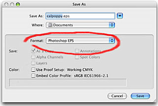
4. SAVE the new EPS or TIFF file. "Save As" to the Documents folder. Format should be either EPS or TIFF.

Note that the file extension will automatically change to ".eps" or ".tif" Don't change the file extension yourself -- let Photoshop do it.


Be sure to give the new file a new name so as to not replace the original (so you will have both a color and grayscale version of your file).

Illustrator (vector) images

If you have an "eps" vector image such as this:


1. Launch Illustrator and open the file.

2. Select the object (in this case Select All).

3. Go to Edit menu>Edit Colors>Convert to Grayscale.

4. "Save as" with ".eps" or ".ai" format and new name to not replace the original (so you will have both a color and grayscale version of your file):


After you're all done converting and saving, PLACE it in your InDesign layout.

Wednesday, February 8, 2012

Making a Layout: The Elements and Principles of Design

The Basic Elements of Design

The basic elements of design are like the ingredients of a recipe. They must be used in the proper combination and proportion to work. A layout may use some but not necessarily all elements.

Line - Any mark connecting any two points. It could be a graphic line, or a string of text.

Shape - Anything that has height and width. Graphics, text blocks, photos.

Texture - The look and feel of a surface. Smooth or bumpy, complicated or simple.

Space - The distance or area between or around things. Does it have breathing room or is it crowded? How is positive (or negative) space used?

Size - How big or small something is. Do the objects in the layout have contrasting or similar sizes?

Value - The darkness or lightness of an area or object. Too much text and crowded graphics give and overall dark value.

Color - Just what is it. Conveys emotion or mood, highlight important items, and so much more!

The Principles of Design

Once you understand the basics, put them together using the recipe dictated by design principles. As with the elements, a layout takes all these principles into consideration, but does not necessarily have to utilize them all.

Balance - An equal distribution of weight. Unbalanced layouts (used with care) can be used for emphasis.

Repetition (Rhythm) - Created by repeating elements. Similar shapes, sizes, colors.

Emphasis - What stands out and gets noticed first.

Unity - All the elements look like they belong together. What holds it all together?

Organize your thoughts

Organization is also important to a successful layout. Arrange your information logically, most important first, then in decreasing order of importance. Catch and hold the reader's attention with headlines and graphics, keep them reading with well-written copy and pleasing design.

Placement on the page can indicate the importance of text or a graphic:

Upper Left - #1
Position of highest prominence, emphasis or importance

Upper Right - #2
Second most prominent

Lower Left - #2
Second most prominent, equal in importance to Upper Right

Lower Right - #3
Least important


How a reader looks at your layout is almost as important as what they read. English-speakers are taught to read from top to bottom, left to right and generally that's how the reader's eyes will travel across a page. You can also direct the way they view the page by the pictures you use and how they are arranged. Some pictures are natural "pointers" such as a person's profile. The reader will naturally look in the direction that the photo is "looking." The composition of photos and graphics also lend themselves to "pointing."

Consider the way your eye travels across the page. You read from left to right, and a harmonious layout will keep with that flow. If you wish to shock the reader, work contrary to their expectations.

The next time you look at a magazine cover or poster or... well...anything... make a note of how you look at it.

One more thing... or two...

Keep your reader in mind while designing and writing your layout. Are they twelve-year-olds? Do you think they'll have at least a high school education? Are they retired Republicans or young Democrats? Different groups of people have different expectations and assumptions of what they read.

Make it easy for your reader to get your message. Use the K.I.S.S. strategy: "Keep it Sweet and Simple." If something looks difficult to read, the reader will probably pass it over for something that appears easy to read.

Examples of Layout and Color


The bold sweeping lines lead the reader's eye from top left to bottom right, while the bright yellow color gets the reader's attention and draws it to the text. Blue and yellow are primary colors; yellow and orange are analogous; blue and orange are complementary.


Interesting triangular shapes combine with primary colors: red, yellow, blue.


Analogous and warm colors: yellow and red. The mug's cool color is a refreshing contrast to the rest of the layout. And, best of all, text on a path!


Analogous and cool colors: Blue, green and purple. How tranquil. The warm (yellow-gold) teddy bear stands out -- contrasts -- with the cool colors in the rest of the layout.


Analogous colors: green, blue and yellow.


Analogous colors: blue and yellow. Similar value create a sense of harmony and peace.


Red, pink (a tint of red), blue and green are the dominant colors in this layout. Red/pink is complementary to the green background.White is neutral and provides a contrasting value to the dark blue.


Purple eggs? Complements those yellow yolks.


Complementary colors in nature: red and green. Elegant, organic shapes.


Primary colors: red, yellow, blue. Great curvy shapes bracket the main images.


Similar rectangular shapes and primary colors (yellow and blue) create a bold and energetic layout.


The sweeping line across the page creates a dynamic division between negative and positive space.


Purple and green are secondary colors and are also analogous. Rhythm is created by the repeated shapes (circles or dots) as they appear to "march" up the page to the headline while the triangles interspersed in the word "TABS" point down to it. The "O" in "DOT" repeats the circle theme.


Wow! These colors are saturated! Products in repeated (rhythmic) compartments of similar shapes unify the layout.


Color which is in counter to the reader's expectations can be a great attention-getter. Yellow star and type is complementary to the purple catsup bottle. Take note of the text wrap on either side of the bottle and the shapes created by both bottle and blocks of text.


This layout illustrates the use of repeated shapes and colors to unify the design through similarity and rhythm.


Repeated hand shapes frame the title of this piece. There is a strong contrast between the values of the dark background and light text purple hand. Purple and green are secondary and analogous colors.


Strong red lines surround a human figure, echoed in the repeated human figures below. The warm colors (red lines) and cool colors (blue background and dancers) and light and dark values create contrast.


Blue and orange --- complementary colors --- create a vibratory effect. Roof tiles create a strong lines. Repeated bird images create rhythm with a twist: three at the bottom look right, but the one at the top looks left.