The bold sweeping lines lead the reader's eye from top left to bottom right, while the bright yellow color gets the reader's attention and draws it to the text. Blue and yellow are primary colors; yellow and orange are analogous; blue and orange are complementary.

Interesting triangular shapes combine with primary colors: red, yellow, blue.

Analogous and warm colors: yellow and red. The mug's cool color is a refreshing contrast to the rest of the layout. And, best of all, text on a path!

Analogous and cool colors: Blue, green and purple. How tranquil. The warm (yellow-gold) teddy bear stands out -- contrasts -- with the cool colors in the rest of the layout.

Analogous colors: green, blue and yellow.

Analogous colors: blue and yellow. Similar value create a sense of harmony and peace.

Red, pink (a tint of red), blue and green are the dominant colors in this layout. Red/pink is complementary to the green background.White is neutral and provides a contrasting value to the dark blue.

Purple eggs? Complements those yellow yolks.

Complementary colors in nature: red and green. Elegant, organic shapes.

Primary colors: red, yellow, blue. Great curvy shapes bracket the main images.

Similar rectangular shapes and primary colors (yellow and blue) create a bold and energetic layout.

The sweeping line across the page creates a dynamic division between negative and positive space.

Purple and green are secondary colors and are also analogous. Rhythm is created by the repeated shapes (circles or dots) as they appear to "march" up the page to the headline while the triangles interspersed in the word "TABS" point down to it. The "O" in "DOT" repeats the circle theme.

Wow! These colors are saturated! Products in repeated (rhythmic) compartments of similar shapes unify the layout.

Color which is in counter to the reader's expectations can be a great attention-getter. Yellow star and type is complementary to the purple catsup bottle. Take note of the text wrap on either side of the bottle and the shapes created by both bottle and blocks of text.

This layout illustrates the use of repeated shapes and colors to unify the design through similarity and rhythm.

Repeated hand shapes frame the title of this piece. There is a strong contrast between the values of the dark background and light text purple hand. Purple and green are secondary and analogous colors.

Strong red lines surround a human figure, echoed in the repeated human figures below. The warm colors (red lines) and cool colors (blue background and dancers) and light and dark values create contrast.

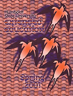
Blue and orange --- complementary colors --- create a vibratory effect. Roof tiles create a strong lines. Repeated bird images create rhythm with a twist: three at the bottom look right, but the one at the top looks left.
No comments:
Post a Comment