These sites are rich with data:
If those don't float your boat, you can try digging around in these sites:
Visit my Delicious.com Infographic collection for inspirational eye candy:
Happy hunting!
Sunday, April 1, 2012

Study Guide for April 9 Quiz
The quiz scheduled for April 9 will be a sort of "practical" exam: I'll give you a printout of a flier, you will recreate it. You'll need to match the typefaces and layout as precisely as you can.
You will need to be able to:
You will need to be able to:
- Create a new document
- Place, scale and rotate art
- Match basic typefaces
- Create and format text using Character and Paragraph panels
- Create basic shapes such as a rectangle or ellipse
- Use the spelling checker
- Export and print a PDF
Infographics or Infoporn?
You've seen them. You've used them. But just what are infographics? Simply put,
An infographic combines data visualization and illustration to communicate, inform, persuade or even indulge in a little humor.
Basic types of information graphics
There are two types of infographics: objective and subjective.
Objective graphics present information without bias in such a way that the reader can draw his/her own conclusions. They are intended to educate or even document events. In an objective infographic, all data and points of view are represented equally.


Subjective graphics are often intended to be persuasive and may have an agenda. Information may be edited or left out altogether. This is not necessarily bad -- simply be aware of bias inherent to the graphic.
A subset of subjective infographics are considered indulgent, entertaining or amusing, particularly because they communicate no data or information whatever. They present content for the sake of the content alone.

What makes a good infographic?
Infographics take on many shapes and forms, from tables and charts to complex illustrations, but any good infographic

Links
http://en.wikipedia.org/wiki/Information_graphics
http://commons.wikimedia.org/wiki/Category:Information_graphics
"Information graphics or infographics are graphic visual representations of information, data or knowledge. These graphics present complex information quickly and clearly, such as in signs, maps, journalism, technical writing, and education."
-- http://en.wikipedia.org/wiki/Information_graphics
An infographic combines data visualization and illustration to communicate, inform, persuade or even indulge in a little humor.
Basic types of information graphics
There are two types of infographics: objective and subjective.
Objective graphics present information without bias in such a way that the reader can draw his/her own conclusions. They are intended to educate or even document events. In an objective infographic, all data and points of view are represented equally.


Subjective graphics are often intended to be persuasive and may have an agenda. Information may be edited or left out altogether. This is not necessarily bad -- simply be aware of bias inherent to the graphic.
 |
| New America Foundation/Good/DeepLocal |
A subset of subjective infographics are considered indulgent, entertaining or amusing, particularly because they communicate no data or information whatever. They present content for the sake of the content alone.

What makes a good infographic?
Infographics take on many shapes and forms, from tables and charts to complex illustrations, but any good infographic
- Will have a meaningful relationship between content and form (presentation)
- Will suggest or allow high-level conclusions to be drawn from either a user-defined (objective) or persuasive (subjective) presentation
- Can stand on its own
- Cites data source(s) for legitimacy
- Shows accurate comparisons (see cookie graph above)
- Is clearly titled, labeled and captioned
- Start with data and clear goals or a good question. Organize the information!
- Ask yourself what it is you want people to understand from reading your graphic. Can the reader obtain high-level information from your graphic?
- Avoid the look of objectivity if the goal of the graphic is to be persuasive (in other words, be honest).

Links
http://en.wikipedia.org/wiki/Information_graphics
http://commons.wikimedia.org/wiki/Category:Information_graphics
Sunday, March 18, 2012
No Photo Was Ever Harmed by the Addition of A Caption
Never think that a photo is self-evident – most often they are not. What if I didn't add a caption to this photo? Would you understand what's going on?
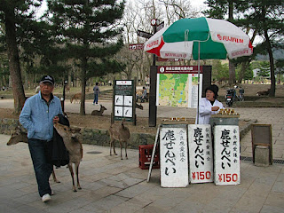 Captions can
(OK, smartypants, if you know so much, add the caption in the comments below …)

- Explain what is going on in the photo
- Identify people whenever possible (especially if their faces are clearly visible)
- Describe the larger context
- Insulting your reader by writing ridiculously simple captions, like "Man in a park with a deer."
- Using gratuitous or superfluous photos or illustrations
- Distorting photos when scaling (hold down that Shift key!)
- Illustrate the story
- Strengthen your layout
- Give your readers a sense of the big picture
(OK, smartypants, if you know so much, add the caption in the comments below …)
Wednesday, March 7, 2012


Wednesday, February 29, 2012
Typesetting Style Guidelines
Your typesetting will look professional when you follow these style guidelines.
Don't confuse readablility with legibility
Legibility is primarily the concern of the typeface designer, to ensure that each individual character or glyph is unambiguous and distinguishable from all other characters in the font. Legibility is also in part the concern of the typographer to select a typeface with appropriate clarity of design for the intended use at the intended size. An example of a well-known design, Brush Script, contains a number of illegible letters since many of the characters can be easily misread especially if seen out of textual context.
Readability is primarily the concern of the typographer or information designer. It is the intended result of the complete process of presentation of textual material in order to communicate meaning as unambiguously as possible. A reader should be assisted in navigating around the information with ease, by optimal inter-letter, inter-word and particularly inter-line spacing, coupled with appropriate line length and position on the page, careful editorial “chunking” and choice of the text architecture of titles, folios, and reference links.
One of the clearest distinctions between the two concepts was presented by Walter Tracy in his Letters of Credit:
Widows and Orphans
In typesetting, widows and orphans are words or short lines at the beginning or end of a paragraph, which are left dangling at the top or bottom of a column, separated from the rest of the paragraph. There is some disagreement about the definitions of widow and orphan; what one source calls a widow the other calls an orphan. The Chicago Manual of Style uses these definitions:

Use only one space between sentences (double spacing is only for those dinosaurs we call typewriters).
Use real quotation marks and apostrophes (Preferences>Use typographers quotes); use proper punctuation with parentheses.
Use special characters (glyphs), en and em dashes (to differentiate from hyphens) where appropriate.
- Hyphen -
- en (n) dash (option + -) –
- em (m) dash (shift + option + -) —
Spend the time to make nice fractions and use correct accent marks (glyphs).
Use bold or italic for emphasis, never underline. Use them sparingly.
AVOID THE USE OF ALL CAPS, even in headlines. It looks like you're screaming.
Kern (tighten or decrease tracking) headlines when necessary.
Never, ever use the spacebar to align text! Use Paragraph Alignment.
Regarding the indenting of paragraphs: use a one-em first line indent space on all indented paragraphs; don't indent first paragraphs. Use the Paragraph Panel and Paragraph Styles to define indents.
Leave no widows or orphans (see below).
Avoid more than two hyphenations in a row. Avoid too many hyphenations in any paragraph; check line breaks carefully.
Keep line spacing (leading) consistent.
Either indent the first line of paragraphs or add extra space between them -- but not both.
Never justify text on a short line.
Avoid combining more than three typefaces in a document.
Let your text breathe: embrace white space; don't crowd text inside a box or up against a graphic element.
Use bullets when making a list, not hyphens.
Avoid abbreviations.
Reduce the size of punctuation marks in headlines; avoid hyphenation in headlines
Set the space before an italic word in italic, but not the space after.
Don't be a wimp.
-- Adapted from "The Mac is not a Typewriter," Robin Williams, 2003
Don't confuse readablility with legibility
Legibility is primarily the concern of the typeface designer, to ensure that each individual character or glyph is unambiguous and distinguishable from all other characters in the font. Legibility is also in part the concern of the typographer to select a typeface with appropriate clarity of design for the intended use at the intended size. An example of a well-known design, Brush Script, contains a number of illegible letters since many of the characters can be easily misread especially if seen out of textual context.
Readability is primarily the concern of the typographer or information designer. It is the intended result of the complete process of presentation of textual material in order to communicate meaning as unambiguously as possible. A reader should be assisted in navigating around the information with ease, by optimal inter-letter, inter-word and particularly inter-line spacing, coupled with appropriate line length and position on the page, careful editorial “chunking” and choice of the text architecture of titles, folios, and reference links.
"These … ‘two aspects of a type’ … are … ‘fundamental to its effectiveness. Because the common meaning of 'legible' is 'readable' there are those – even some professionally involved in typography – who think that the term 'legibility' is all that is needed in any discussion on the effectiveness of types. But legibility and readability are separate, though connected aspects of type. Properly understood … the two terms can help to describe the character and function of type more precisely than legibility alone. … In typography we need to draw the definition … of legibility …to mean the quality of being decipherable and recognisable – so that we can say, for example, that the lowercase h in a particular old style italic is not legible in small sizes because its in-turned leg makes it look like the letter b; or a figure 3 in a classified advertisement is too similar to the 8. … In display sizes, legibility ceases to be a serious matter; a character that causes uncertainty at 8 point size is plain enough at 24 point."
Read more at http://en.wikipedia.org/wiki/Typography
Widows and Orphans
"Never leave widows and orphans bereft on the page."
— "The Mac is not a Typewriter," Robin Williams
— "The Mac is not a Typewriter," Robin Williams
In typesetting, widows and orphans are words or short lines at the beginning or end of a paragraph, which are left dangling at the top or bottom of a column, separated from the rest of the paragraph. There is some disagreement about the definitions of widow and orphan; what one source calls a widow the other calls an orphan. The Chicago Manual of Style uses these definitions:
Widow
- A paragraph-ending line that falls at the beginning of the following page/column, thus separated from the remainder of the text. (See below, paragraph #1.)
Orphan
- A paragraph-opening line that appears by itself at the bottom of a page/column. (See below, highlighted text.)
- A word, part of a word, or very short line that appears by itself at the end of a paragraph. Orphans result in too much white space between paragraphs or at the bottom of a page.
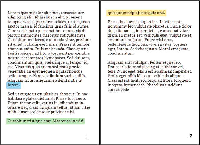
A common mnemonic (memory "hook") is, "An orphan has no past; a widow has no future," or "An orphan is left behind, whereas a widow must go on alone." Think of it this way: orphans are younger than widows, thus orphaned lines happen first at the start of paragraphs (affecting and stranding the first line) and widowed lines happen last at the end of paragraphs (affecting and stranding the last line). Orphaned lines appear at the "birth" (start) of the page or column; widowed lines appear at the "death" (end) of paragraphs.
Type on a path

Type can also be set along a vector path – be it a curvy path or a polygon, or open or closed path. Draw a path, then click and hold on the Text Tool to get more options. Select the T that's kicked over on its side (Text on Path Tool).

Click on the path with that tool, and type in your text. The text follows the path! What excitement!
To move the type around on the path, click on it with the Selection Tool. Notice the "I-Beam" at the origin point of the text (if the text is set centered, it's in the center of the text; if set justified left or right, it will be at the left or right of the text). Click on the I-Beam with the Selection Tool and drag it to where you want it. If you drag it to the opposite side of the path, it will flip upsidedown.
Align type centered or on the left or right margin using the paragraph palette or control panel.
Tip: If you align the "I-Beam" with the center handle of the bounding box and align text centered using the paragraph palette, your text will center automatically and perfectly.
Tip: Adobe InDesign and Illustrator both allow you to create type on a path, however they behave a little differently. InDesign allows you to put type and a stroke on a single path; Illustrator allows you to put either type or a stroke on a single path (it will not allow both).
Tip: If you want type to stretch over and under an object (such as in the example below) you need to create two separate paths with text on each of them:

Subscribe to:
Posts (Atom)